Thursday 18 March 2010

New Directions?


Above shows using all the space to fit two images on one frame. This could be good for juxtaposition.


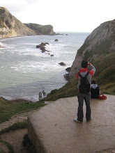
My latest workings show more of the text and image idea along with trying to just take photos without any props in to work along side the view point photos in final pieces. I think by just having a series of photos showing looking out at the surroundings and photos of the surroundings on their own as well will lead to things not getting too over crowded with meaning keeping it simple and still engaging. The Diana Mini camera is a half frame camera so images can be made to come out square with lines of negative space which i feel adds something to what I'm trying to say anyway so I could use this to my advantage.

Monday 15 March 2010

Using Redscale


I'm also doing a few experiments by double exposing photos together to give a dreamlike and spirittual quality to the term 'spirit of place'.


Now I'm thinking about the possibilities of using messages in the image to lend a sense of positive or negative sentiment to the places. By wirting out words of encouragement or praise against insult or pessimistic thoughts leads me to show how a place can give of bad vibes or good vibes expressed with words and feelings by an individuals thoughts. The messages can have a different correlation to the place they are shown in but I want to show a clear and poetic distinction between area.


The idea of tagging lead to mixed reactions from critiques about what I'm trying to represent. In the long run I supose I agree with this so now I'm trying out more new ideas to work alongside my view point idea. The use of too many symbols in the view point and tag pictures perhaps makes everything seem too crowded so now I'm looking at other ways. These photos show my experimentation with redscale film which obviouslt makes everything look red and burnt out. Its an interesting outcome but not one I'll pursue further for final pieces.

Monday 8 March 2010

Place Marking


I also like looking at the idea of what was once there, like with how you can see the outline of where stairs used to be in the above picture. To me this shows how this place was once more inhabited but now falls into disrepair in effect creating dead buildings.


Ok so now I'm experimenting with the idea of tagging and marking a place by denoting it to its good or bad value by puttin the symbol within the scene. I'm interested in getting in close to the texture of surfaces and composition of areas to show my findings. I like how shape and feel add to a place like how grass and flora feels to touch an sense against mould, rubbish, vandalised surfaces or decaying places etc.